I’ve always been interested in design and actually aspired to become a car designer for several years. So when I came up with the idea for some alternative logos for Hai Performance to put on clothing, I decided to tackle the challenge myself. I used Inkscape as vector drawing software. Luckily there are many useful tutorials out there. Drawing the logos comes down mostly to stacking multiple copies of the same object, boolean operations, gradients, and drawing with the Bezier tool.
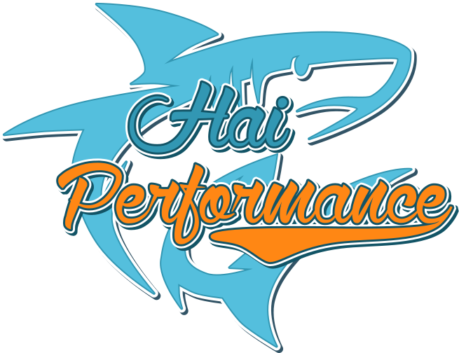
My first attempt was the “Baseball” logo. The text was relatively straightforward, consisting of three layers with the bottom one offset to create the shadow. The Swoosh and the shark are drawn with bezier lines.
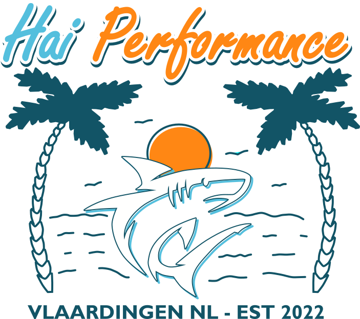
I re-used the shark for the “Surf” logo. The two palm tries are identical, just mirror copies of each other.
The “’70s” logo also uses the big shark. This was quite easy to do once I had found a suitable font.The slanted writing is done by placing the text on a slanted line, then rotating the letters upright again.

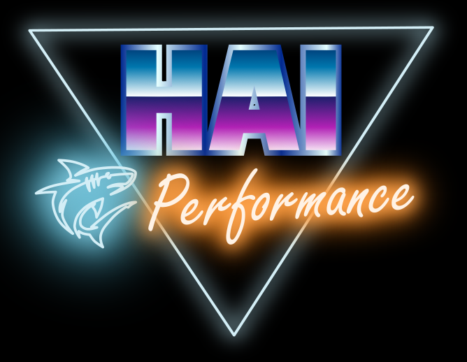
After the ’70s came the ’80s – “Synthwave” is a style commonly associated with this decade. The chrome-look letters are created using gradients. The neon effect was obtained using multiple layers. The lower layers where extended from the text using the outset/offset tool and then blurred. The upper layers where given a lighter color, which is easily done by switching from RGB to HSL mode and increasing the luminance channel.
For the “Speed” logo I needed a smaller shark. Otherwise an easy design with text and shapes slanted 10 degrees and gradients applied to rectangular shapes. The shark is currently white, for printing in two colors it would be necessary to instead subtract the shark outline from the background.

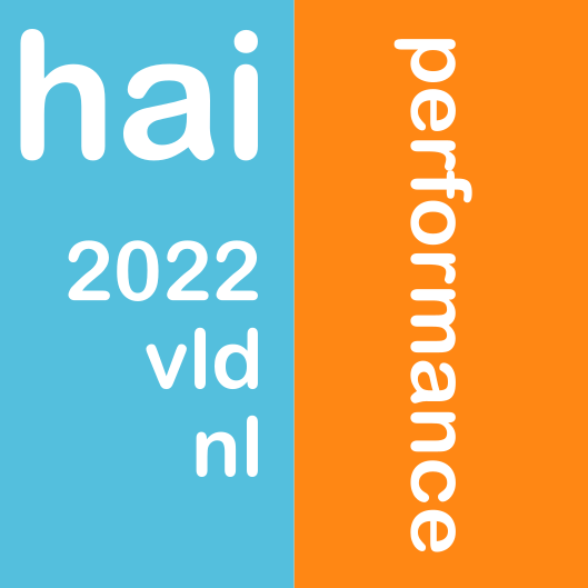
The final colored design is a tribute to Swiss design. Yes it’s a bit simple, but it only took a few minutes to create.
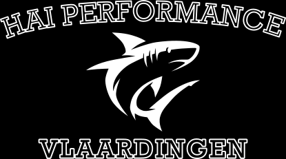
I also created a few monochrome designs that could either be printed white on a dark background or in color on a light background.
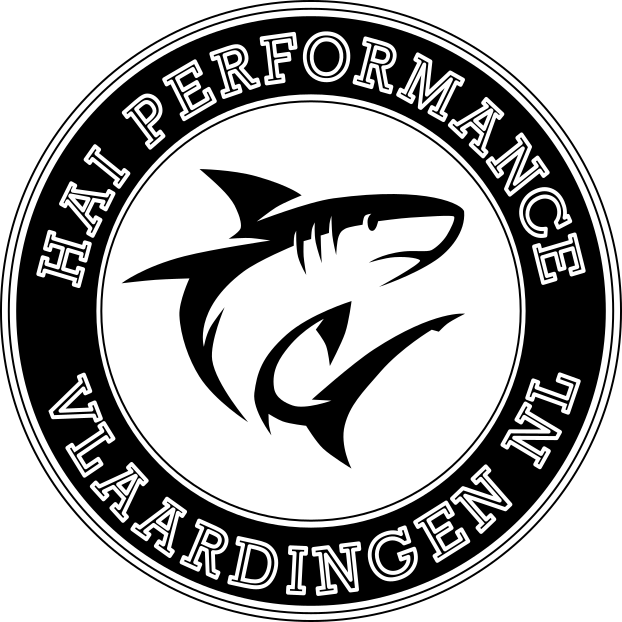
Here’s a round “College-style” logo. It was actually not that easy to arrange both texts in the same circle.
Another style that appears to be possible judging by the number of people wearing clothes with the names of cities they probably have never visited or schools they have never attended (I don’t even know where Hogwarts is). The curved text is created by drawing an ellipse, cutting off parts of it, then using the resulting path for text placement.This log could be made more interesting by introducing another color and/or using different font types.
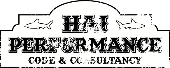
Finally there’s the “Old West” logo. This one took me quite some time to get right. The distressed look is achieved by subtracting a suitable texture. This only works on fills, not strokes – so where otherwise it would be sufficient to create text consisting of two layers, I now needed three as I could only use the fill for each shape. For monochrome printing one would also have to make sure that there’s no white left, subtracting suitable shapes were necessary.
This was a fun exercise in creating logos with Inkscape, and I plan on having some of these printed on shirts and sweaters.

